Overview
Table is a WidgetGroup that sets the position and size of its children using a logical table, similar to HTML tables. Tables are intended to be used extensively in scene2d.ui to layout widgets, as they are easy to use and much more powerful than manually sizing and positioning widgets. Table-based layouts don’t rely on absolute positioning and therefore automatically adjust to different widget sizes and screen resolutions.
Table is a fork of TableLayout for libGDX (by the same author). TableLayout provides the same functionality as Table but for other UI toolkits (Swing, Android, etc).
- Quickstart
- Root table
- Debugging
- Adding cells
- Logical table
- Cell properties
- Defaults
- Values
- Overlapping widgets
- Inserting cells
- Notes
Quickstart
    Label nameLabel = new Label("Name:", skin);
    TextField nameText = new TextField("", skin);
    Label addressLabel = new Label("Address:", skin);
    TextField addressText = new TextField("", skin);

    Table table = new Table();
    table.add(nameLabel);
    table.add(nameText).width(100);
    table.row();
    table.add(addressLabel);
    table.add(addressText).width(100);
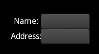
This code adds 4 cells to the table which are arranged in two columns and two rows. The add method returns a Cell, which has methods to control layout. The table sizes and positions its children, so setting the width of the text fields to 100 is done on the table cell, not on the text fields themselves.
Root table
When doing UI layout, a UI widget does not set its own size. Instead, it provides a minimum, preferred, and maximum size. The widget’s parent uses its own size along with these hints to size the widget. Many layouts will use a single table at the root which has a fixed size, often the whole screen. Widgets and nested tables are added to the root table, resulting in a responsive layout that doesn’t rely on fixed positions or fixed sizes.
In libgdx the setFillParent method can be used to easily size the root table to the stage (but should generally only be used on the root table):
    Table table = new Table();
    table.setFillParent(true);
    stage.addActor(table);
Debugging
Table can draw debug lines to visualize what is happening in the layout. It is enabled following way:
table.setDebug(true); // turn on all debug lines (table, cell, and widget)
Adding cells
Widgets are added to a table with the add method. This adds a cell to the current row. To move to the next row, call the row method.
    table.add(nameLabel);
    table.add(nameText);
    table.row();
    table.add(addressLabel);
    table.add(addressText);
The add method returns a Cell, which has properties that control the layout. Every method on the cell returns the cell, allowing calls to be chained.
table.add(nameText).padLeft(10).width(100);
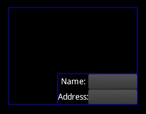
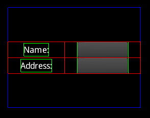
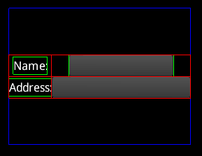
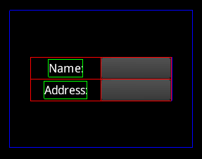
Logical table
The cells make up a logical table, but it is not sized to the table widget.
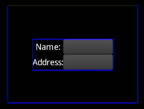
The outer blue rectangle shows the size of the table widget. The inner blue rectangle shows the size of the logical table, which is aligned to center by default. The alignment can be changed using methods on the table. The table methods return the table, so can be chained just like the cell methods.
table.right().bottom();
Cell properties
Expand
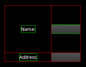
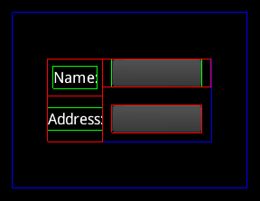
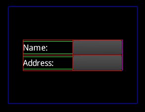
To make the logical table take up the entire size of the table widget, TableLayout needs to be told which cells will receive the extra space.
    table.add(nameLabel).expandX();
    table.add(nameText).width(100);
    table.row();
    table.add(addressLabel);
    table.add(addressText).width(100);
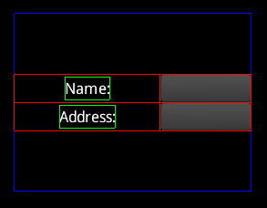
The red lines show the cell bounds and the green lines show the widget bounds. Note that the left column has received all of the extra space in the x direction. Only one cell needs to have expand to cause the entire column or row to expand. If multiple columns expand, the extra space is distributed evenly.
    table.add(nameLabel).expandX();
    table.add(nameText).width(100).expandX();
    table.row();
    table.add(addressLabel);
    table.add(addressText).width(100);
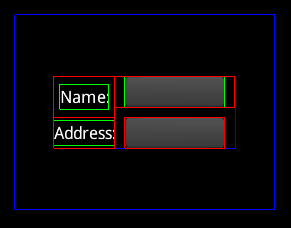
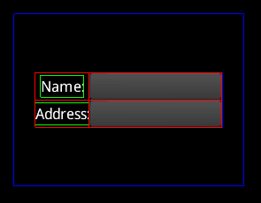
Expand also works in the y direction via the expandY method. The expand method causes expand to happen in both directions.
    table.add(nameLabel).expand();
    table.add(nameText).width(100);
    table.row();
    table.add(addressLabel);
    table.add(addressText).width(100);
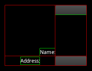
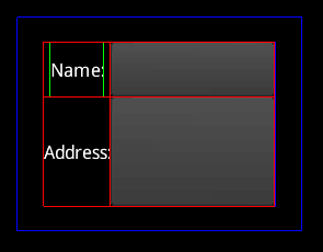
Alignment
Similar to aligning the logical table, a widget can be aligned inside the cell.
    table.add(nameLabel).expand().bottom().right();
    table.add(nameText).width(100).top();
    table.row();
    table.add(addressLabel);
    table.add(addressText).width(100);
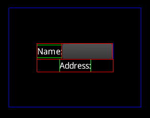
Fill
The fill method causes a widget to be sized to the cell. Like expand, there are also fillX and fillY methods.
    table.add(nameLabel).expand().bottom().fillX();
    table.add(nameText).width(100).top();
    table.row();
    table.add(addressLabel);
    table.add(addressText).width(100);
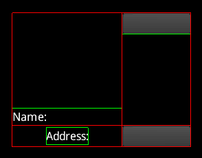
Note the red cell lines are drawn on top of the green widget lines.
Widget size
By default, the table attempts to size widgets to their preferred size. If the widgets don’t fit, they are sized between their preferred size and their minimum size, with widgets that have a larger preferred size receiving more space. If the widgets don’t fit at their minimum size then the layout is broken and widgets may overlap. The fill methods won’t make a widget larger than the widget’s maximum size.
It is a common beginner’s mistake to attempt to size or position a widget in a table by setting the size on the widget. The table sizes and positions its children using their preferred, minimum, or maximum size, so the table will overwrite any size or position set previously.
Widgets do not provide setters for their preferred, minimum, or maximum size. These values are typically computed by the widget, so would be confusing if they could also be set explicitly. Also, it is not advised to subclass a widget to change these values. Instead, set the preferred, minimum, or maximum size on the cell containing the widget and your value will be used instead of the widget’s value.
    table.add(nameLabel);
    table.add(nameText).minWidth(100);
    table.row();
    table.add(addressLabel);
    table.add(addressText).prefWidth(999);
Here the prefWidth of 999 is larger than the table, so it is sized down to fit.
width is a shortcut method for setting minWidth, prefWidth, and maxWidth to the same value. height is a shortcut method for setting minHeight, prefHeight, and maxHeight to the same value. The size method takes a width and a height and sets all six properties.
Padding
Padding is extra space around the edges of a cell.
    table.add(nameLabel);
    table.add(nameText).width(100).padBottom(10);
    table.row();
    table.add(addressLabel);
    table.add(addressText).width(100).pad(10);
Note that padding between cells combines, so there are 20 pixels between the text fields. The debug lines don’t necessarily show which cell the padding comes from, since it is not important for the layout of the table.
Padding can also be applied to the edges of the table.
table.pad(10);
Spacing
Like padding, spacing is extra space around the edges of a cell. However, spacing between cells does not combine, instead the larger of the two is used. Also, spacing is not applied at the edge of the table. Spacing makes it easy to have consistent space between cells, eg for forms.
    table.add(nameLabel);
    table.add(nameText).width(100).spaceBottom(10);
    table.row();
    table.add(addressLabel);
    table.add(addressText).width(100).space(10);
Note that the spacing between cells doesn’t combine, so there are 10 pixels between the text fields. Also note that there is no spacing under the bottom text field because spacing isn’t applied around the edge of the table.
Colspan
A cell can span multiple columns.
    table.add(nameLabel);
    table.add(nameText).width(100).spaceBottom(10);
    table.row();
    table.add(addressLabel).colspan(2);
Note that there is no rowspan. To acheive this, use a nested table.
Uniform
Cells with uniform set to true will be the same size.
    table.add(nameLabel).uniform();
    table.add(nameText).width(100).uniform();
    table.row();
    table.add(addressLabel);
    table.add(addressText).width(100);
Defaults
Cell defaults
Often many cells have the same properties, so setting the default properties for all cells can greatly reduce the code needed for a layout. The defaults method on the table returns a cell whose properties are the defaults for all cells.
    table.defaults().width(100);
    table.add(nameLabel);
    table.add(nameText);
    table.row();
    table.add(addressLabel);
    table.add(addressText);
Column defaults
The columnDefaults method on the table returns a cell whose properties are the defaults for all cells in that column. Any properties set here will override the cell default properties. Columns are indexed starting at 0.
    table.columnDefaults(1).width(150);
    table.add(nameLabel);
    table.add(nameText);
    table.row();
    table.add(addressLabel);
    table.add(addressText);
Row defaults
When the row method is called, it returns a cell whose properties are the defaults for all cells in that row. Any properties set here will override both the cell default properties and the column default properties. Note it is allowed to call row before any cells are added. This allows the first row to have row default properties.
    table.row().height(50);
    table.add(nameLabel);
    table.add(nameText);
    table.row().height(100);
    table.add(addressLabel);
    table.add(addressText);
Values
All values for sizes, padding, etc are actually Value instances. When numeric values are used, Value.Fixed is used. Value allows for more flexibility, eg to base a size or padding on another widget.
    table.add(nameLabel);
    table.add(nameText).pad(new Value.Fixed(10));
    table.row();
    table.add(addressLabel).width(Value.percentWidth(0.33f));
    table.add(addressText);
Overlapping widgets
Table excels at sizing and positioning widgets that do not overlap. To layer widgets on top of each other, a Stack can be used.
Inserting cells
Table allows a cell’s widget to be changed or removed (by setting it to null), but Table currently does not allow cells to be inserted in the middle or removed. To do that, the Table needs to be rebuilt: call clearChildren to remove all children and cells, then add them all to the Table again.
If inserting or removing cells is needed, VerticalGroup or HorizontalGroup can be used.
Notes
- By default, positions and sizes are rounded to integers. This may cause problems when using small values. Use Table#setRound(false) to change it.